In the early 2000s, while I was still a graphic designer, I experienced frustration during my graphic design projects. Indeed, when using geometric typefaces for my layouts, I gradually noticed a lack of fluidity and legibility when reading long blocks of text. As a budding typographer, this realization marked the beginning of a deep reflection on the creation of a text typeface. I had already created some more expressive typefaces for headlines but had yet to design a font family versatile enough for body text. At that point, I wanted a typeface that combined visual comfort with geometric shapes to meet my needs.
In 2008, after some sketches on paper, I began developing the prototype in FontLab, giving birth to Sofia Pro. A few months later, I had the first workable version. While imperfect in terms of extended language support and OpenType features, it embodied my initial idea of creating a more fluid reading experience with a geometric font. There were still adjustments to be made, but the positive feedback from users motivated me to continue developing the typeface.
In 2012, I undertook a thorough revision of this version. I completely redesigned certain letterforms, refined the terminals, increased the x-height to improve legibility at small sizes, and standardized the character widths. These adjustments helped improve overall readability and harmonize the rhythm of the words. The new version of Sofia Pro allowed each character to « breathe » while maintaining enough originality for impactful headlines. Since the second version, I have continued to improve Sofia Pro regularly to meet the needs of the most demanding professionals. I also developed a variable version in multiple widths and expanded its availability to over 220 languages. This new release of the font renews the relevance of Sofia to a new generation of graphic designers.
Sofia Pro, though an heir to Paul Renner’s Futura, has evolved over time to establish a modern and distinctive identity. Its adoption by prestigious brands internationally has solidified its place in the world of contemporary communication. In our digital media age, it has fully earned its place as a popular geometric typeface and stands out with its « digital-friendly » aspect. It is thanks to the enthusiasm of designers worldwide that Sofia Pro has distinguished itself in the vibrant typographic world and gained the popularity it enjoys today. The data speak to its incredible popularity among both print and digital designers: in 2024 alone, more than 14 million daily users and over 70 billion web page* views relied on Sofia Pro. Sofia Pro Regular styles content on more than 7 billion web pages every day (* source : Adobe Fonts).
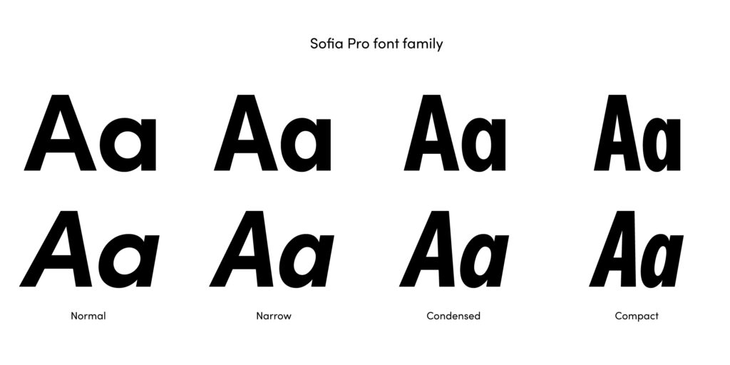
I am deeply moved to see how Sofia Pro has been integrated into such diverse contexts. I am also grateful to all the professionals using Sofia Pro for their projects and hope that many more will continue to explore its full creative potential. This update is more than just an evolution — it’s a key milestone for this type family, which becomes more versatile and redefines how designers approach typography. With its new Compact and Narrow styles, a total of 64 fonts, and variable versions offering even greater precision, these additions will meet the needs of the most demanding designers in editorial creation and graphic design, while enhancing the original style, already widely appreciated for its clarity and elegance.
An all-new version of Sofia Pro will be released on April 2025.