Created and released in 2025, I wanted to share a few insights here about its design and the reasons that motivated me to create this typeface. Readability is, to me, one of the pillars of type design, because if a typeface is hard to read, the message it carries fails to achieve its purpose. Through this article, I wanted to share a few notes about the design of Parisco, hoping you’ll enjoy reading about it as much as I enjoyed designing it.
In recent years, the question of character readability has been making a regular comeback in typographic discussions. Specialized blogs, academic articles, and social networks: everywhere, the notion of readability has emerged as a central concern. Behind this word lies not just an aesthetic preference, but the reading experience itself. Every detail, from letter shapes to spacing and contrast, contributes to the reader’s visual comfort.
One might think that serif typefaces such as Times New Roman, Garamond, or Baskerville naturally offer an advantage thanks to their contrasting and firmly anchored shapes. However, no solid study has ever confirmed that any particular style or letter shapes, whether serif or sans serif, objectively improve readability.
In fact, studies have shown that factors such as the spacing between letters and words are far more important than the specific shapes of the letters. 1
In practice, sans serif typefaces dominate, especially in the digital world. In United States, nearly 85 % of websites use fonts like Roboto, or Open Sans, chosen for their clarity on screens. In 2025, they represented around 61 % of all fonts used online, a clear sign of their readability and contemporary aesthetic.
One term kept coming up in these studies: dyslexia. People with dyslexia represent 5 to 10 % of the global population, which is between 390 and 780 million individuals 2. The subject is fascinating and complex because there are many forms of dyslexia, each posing different challenges. Reading these studies, one thing became clear : no typeface, even a perfectly designed one, can on its own resolve the difficulties faced by dyslexic readers or those with reading disorders, nor can it increase the reading speed of people without visual difficulties. There is no such thing as a “magic” typeface.
Typographic accessibility is therefore above all a collective effort. It depends as much on the type designer who shapes the letters as on the graphic designer who stages them on the page. From the shape of a single letter to the composition of a page, each decision contributes to a reading experience that is smoother, fairer, and more human.
When it comes to so-called “accessible” typefaces, a few exceptions exist, such as Atkinson Hyperlegible, specifically designed to improve readability. However, they remain extremely rare. The vast majority of fonts available on platforms such as Google Fonts or Adobe Fonts are not optimized for accessibility. Of the more than 1 800 families available on Google Fonts, only a handful truly address the needs of dyslexic or visually impaired readers, around 0.055 % of the total.
There are, however, a few dedicated typefaces, including some of the best-known: OpenDyslexic (developed by Abelardo González), Dyslexie Font (created by Dutch designer Christian Boer), and Lexia Readable (created by the K-Type foundry) 3.
Tracing the Roots of Readability
When I began addressing the question of readability and typographic accessibility, it seemed necessary to first look back. Exploring history often helps us better understand the foundations on which today’s typography is built. Interestingly, the first principles of accessibility appeared much earlier than one might think, and were often driven by a form of activism, a clear will to improve reading for everyone.
For a long time, certain letters were not distinguished from one another. The most famous case is that of U and V, which were used in a particular way until the 18th century. In old texts, the same character could stand for both the vowel u and the consonant v, leaving it up to the reader to guess the correct sound from the context. The progressive differentiation of these two symbols marked an important milestone: it clarified the written word, brought written texts closer to spoken language, and made daily reading easier.
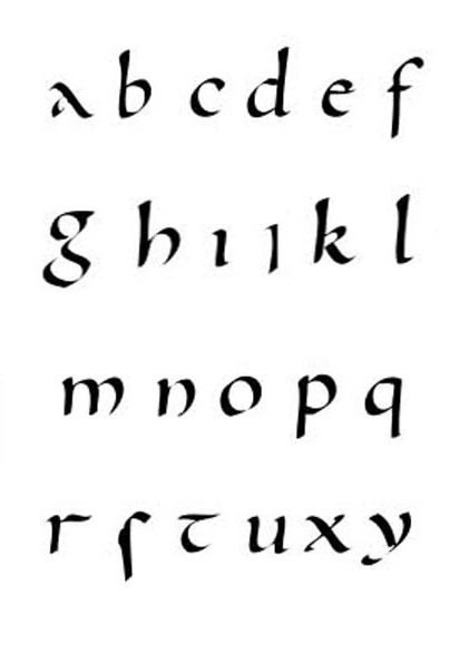
Similarly, the invention of lowercase letters by Benedictine monks in the 8th century was a major turning point. Initially motivated partly by economic reasons, in order to save precious parchment made from calfskin 4, this reform soon took on a much broader impact under Charlemagne’s influence. It helped unify and clarify writing throughout the empire. The introduction of two graphic hierarchies, uppercase and lowercase, not only improved readability but also gave rhythm to the text and made it easier to understand.
Awareness of reading disorders, however, is much more recent. It began to emerge in the 19th century, but it was not until the 20th century that they were truly recognized as specific disorders, and not as a simple lack of effort or intelligence.
Accessibility, a Forgotten Issue
Looking at current design practices reveals a striking fact: today, many designers seem to have distanced themselves from the question of accessibility. Their attention is focused mainly on visual impact and the beauty of letterforms, often pushing readability to the background. According to a recent study, barely half of designers rank typographic clarity as their number-one criterion when choosing a typeface (Source DesignRush) 5 6.
Parisco’s Typographic Approach
It was in response to this situation that I began thinking differently. Rather than opposing beauty and readability, why not try to reconcile them? The goal was simple: to imagine a typeface that would offer optimal reading comfort while still having enough personality to appeal to designers and make them want to use it. In other words, readability had to become a true act of design.
The intention was not to create a typeface dedicated solely to people with dyslexia. Their needs are very specific, and as mentioned above, a typeface, even a well-designed one, cannot on its own solve all reading difficulties.
The design intentions were broader: each letter had to breathe, to have its own identity, but never at the expense of text fluidity. An accessible, elegant, and harmonious writing system, able to please both the reader’s eye and the creative’s.
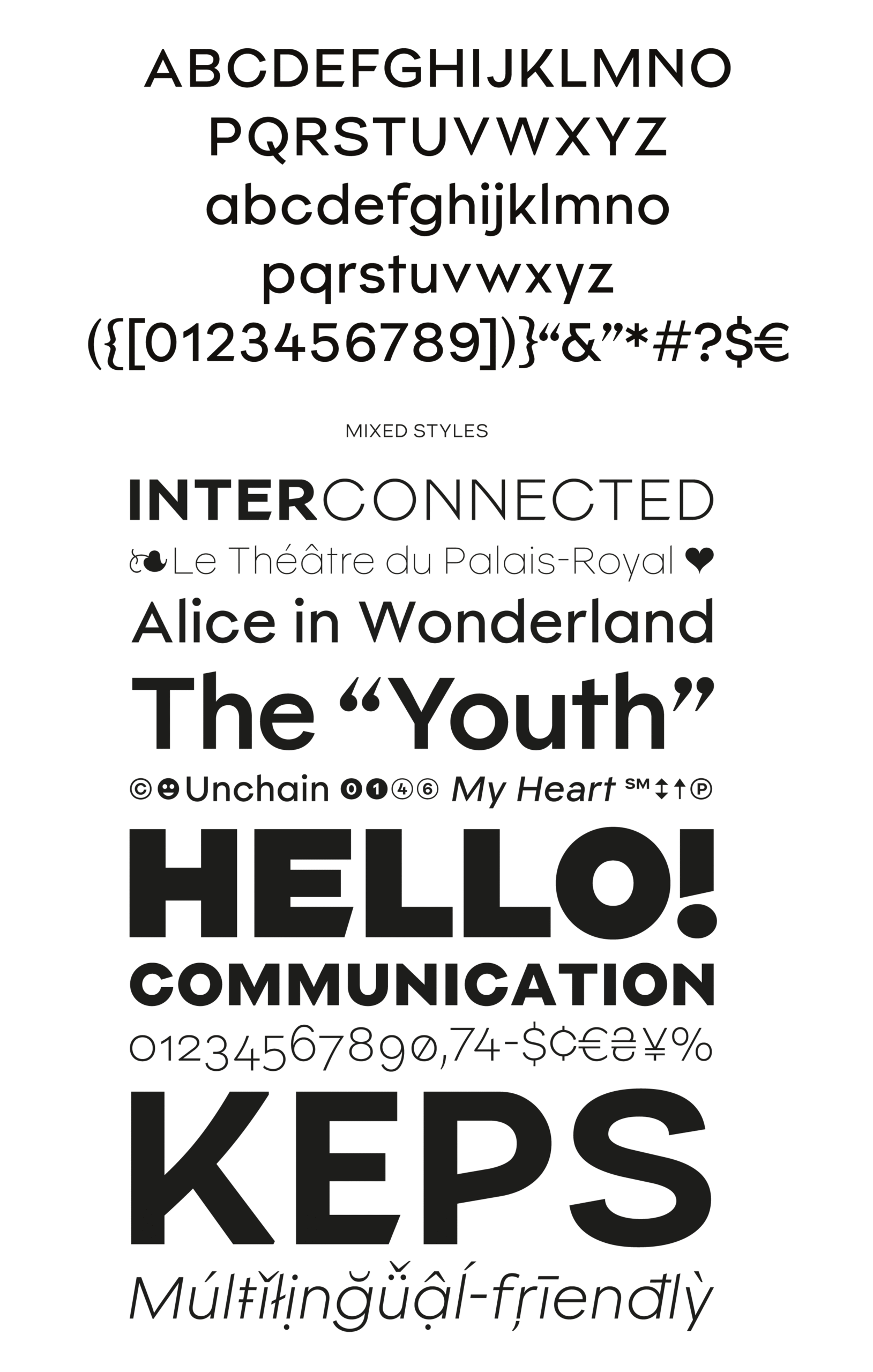
This approach led me to focus on details that most people never notice, but that make all the difference: the angle of stroke endings, slightly wider character widths, spacing between glyphs, balanced proportions, or contrast level. Each small adjustment, combined, shapes the reading experience. And behind each of them, one recurring question remained: how to inspire designers to reconnect with accessibility and give readability the place it deserves?
As the first link in this chain of accessibility, a visual guideline was defined based on a few simple principles: clearly distinguish mirrored letters, work on contrasts, differentiate commonly confused shapes, and introduce subtle asymmetry in certain letters without losing overall graphic coherence.
Choosing a Geometric Typeface: Familiarity Creates Comfort
We live in a world where geometric typefaces are widely used, in other words, a « world of geometric sans ». They are everywhere around us. Above all, it is readers’ familiarity with these letterforms that ultimately improves character recognition. I therefore chose to design a geometric typeface that would already feel familiar : familiarity creates reading comfort. The synthetic forms of the letters also make shape recognition easier.
Design Details Built into Parisco
Rather than opposing aesthetics and readability, the goal was to reconcile the two, creating a typeface designed for reading comfort while still having enough personality to appeal to designers. In other words, readability had to become a true act of design in itself.
The concept of a geometric typeface relies on simple shapes, free of superfluous details. For Parisco, several adjustments were made to improve the reading experience: a slightly taller x-height than a typical geometric, slightly longer descenders to help distinguish descending-stem letters, and harmonized heights to strengthen the relationship between capitals and lowercase (especially when inserting capitals in running text).
Some stroke endings were opened or angled differently, such as on the C, to avoid overly closed terminals that could hinder recognition. Contrast and asymmetry were also refined: letters that were initially symmetrical were made slightly asymmetrical. After some research, this approach proved essential to meet the needs of readers with reading disorders. A study conducted by Albert Le Floch and Guy Ropars showed that the absence of asymmetry in the foveas could disrupt brain connectivity, causing overly strong interhemispheric visual connections and making it difficult to distinguish symmetrical letters.
For Parisco, the crossbars of N and Z, both uppercase and lowercase, were adjusted to reduce this symmetry and improve readability. This asymmetry is more noticeable in medium weights such as Regular (400) or Medium (500). Contrast was adjusted so that the final shape of an O, for example, appears smooth and truly circular.

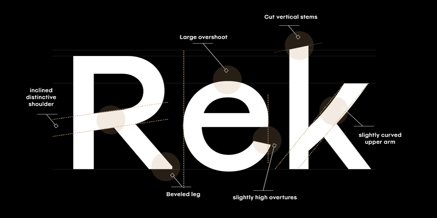
The stability of letters on the baseline was also a key concern. Design adjustments were made to letters with heavier vertex points, such as lowercase and uppercase V and W, as well as on the start of diagonals at the baseline.
Parisco also makes a deliberate choice for the capital I. Many so-called accessible fonts add two horizontal bars at the top and bottom of the cap height to differentiate it from the lowercase l. However, this solution can harm elegance compared to the small benefit it brings to reading flow. There is no conclusive evidence that this modification actually improves differentiation. In Parisco, the standard typographic design already distinguishes the lowercase l from the capital I without relying on these visible tweaks or extra glyph sets, preserving both comfort and readability.
Fine-Tuned Control of Readability and Design
Parisco also includes several OpenType features designed to enhance the reading experience and provide great flexibility of use. Specific stylistic alternates were created to improve legibility and accessibility by refining the differentiation of certain characters.
The family also offers a full set of lowercase and uppercase letters to give rhythm to both titles and running text, as well as a set of expressive capitals to bring originality and impact to large titles. These options let designers fine-tune the typography to the context, composing pages that are more readable, dynamic, and distinctive.
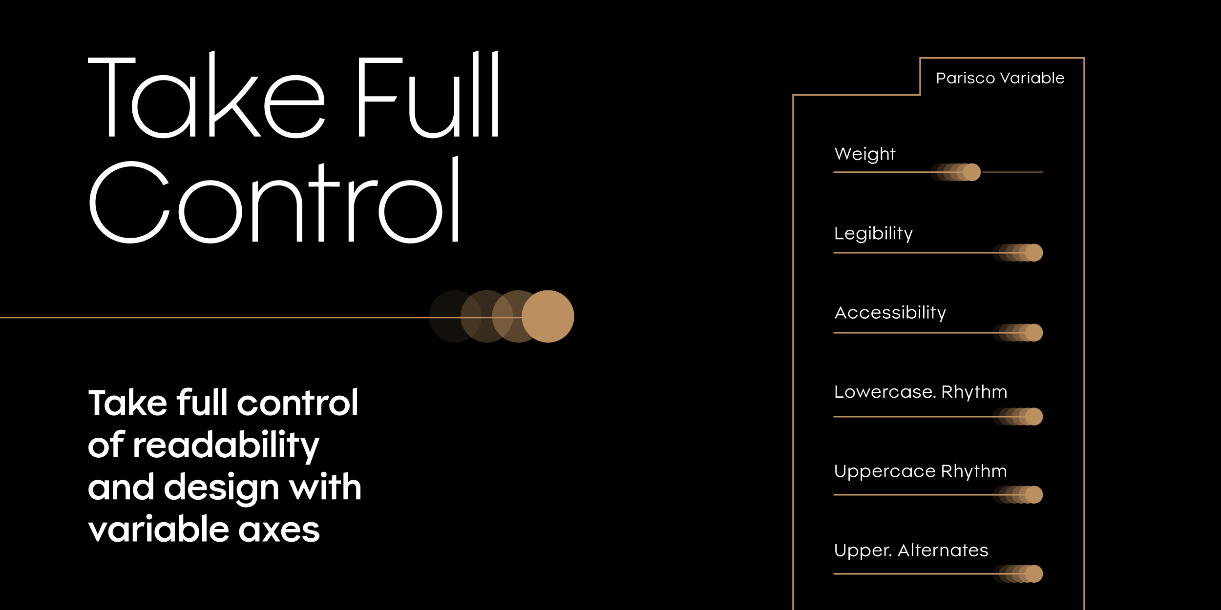
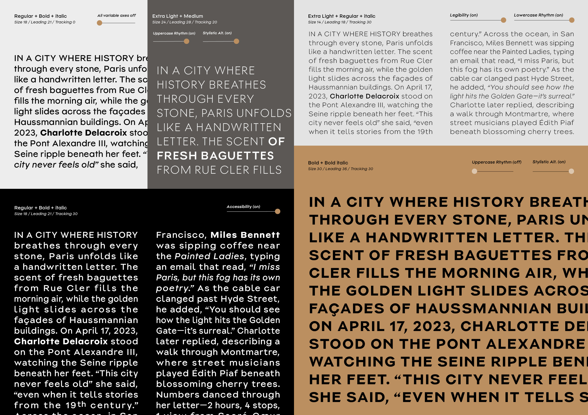
The variable version brings these OpenType functions into unique axes, allowing precise adjustments of various parameters directly from the variable fonts panel of compatible software. Readability, accessibility, weight, italics, rhythm, and stylistic variants can all be individually adjusted with a simple slider, while preserving the harmony and coherence of the typeface. Even when letters shift along the selected axes, they fully retain Parisco’s spirit and identity.
The intention was not to create a typeface dedicated solely to people with dyslexia. Their needs are very specific, and as mentioned above, a typeface even if well-designed cannot on its own solve all reading difficulties.
➝ Discover Parisco on Mostardesign Type foundry
➝ Download the Parisco PDF specimen
References and Further Reading
- Applying cognitive and perceptual science to typeface choices – Sofie Beier & Myra Thiessen – Taylor & Francis Online ↩︎
- 33 Dyslexia Statistics & Facts: How Many People Have Dyslexia? – Steven Zauderer – Crossrivertherapy ↩︎
- Dyslexia-Friendly Fonts To Facilitate Learning and Reading – Design Mantic ↩︎
- Why were lowercase letters invented, when capital letters would have sufficed? – Slate.fr (Français) ↩︎
- 51% of Designers Demand Legibility: Most Popular Fonts to Use – Rafi Lim – DesignRush.com ↩︎
- Mind the accessibility gaps – most of accessibility issues originate in design – Bogdan Cerovac ↩︎