In the digital age, we spend less and less time formalizing our ideas on paper. However, this stage is much more than just a step. It is, in fact, the starting point and a fundamental part of any typography design process. Not only does it allow for the free exploration of shapes, but it also helps structure these ideas more clearly. This is especially important before moving on to prototyping in GlyphsApp. While this approach may seem simple at first glance, it is essential for laying a solid foundation for type design. Moreover, it helps capture the essence of a stroke and embrace a spontaneity often lost behind a screen. Additionally, it organizes initial ideas in a coherent and structured manner. Therefore, this process remains critical in ensuring that the design evolves with clarity and purpose.
Every type designer has their own method for creating a new font. Some start with a pencil and paper, enjoying the direct connection with the medium, while others prefer to sketch their ideas on an iPad. Personally, I now prefer sketching on paper, but this wasn’t always the case. When I first started in type design, I would dive straight into digital modeling, relying solely on the ideas I had in mind, without taking the time to sketch them on paper. My goal was to move quickly, convinced that digital tools would be enough to translate my intentions. However, this approach often led to frustrating blockages, where the initial idea became difficult to formalize.
I found myself stuck, unable to reproduce exactly what I had imagined, with the very real risk of starting over and over without truly progressing. This process, though fast, limited spontaneity and hindered creative exploration. It also compromised subsequent steps, particularly software prototyping. For example, I found myself creating several versions of the letter ‘a’, almost identical, without being able to choose one. Stuck, my typography project stagnated for an entire day, until I eventually settled on one form, knowing full well that it didn’t quite match my original idea… frustrating!
Sketching without constraints
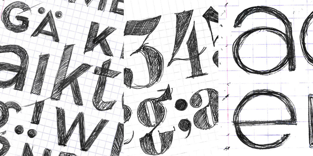
After this realization, I entered a phase of experimentation on paper. Drawing letters by hand, for example, allows me to feel the tension of the strokes. It also helps me perceive the unity of different ideas and analyze the gesture more carefully. This is crucial before moving on to prototyping, as it prevents excessive mechanical rigidity in the final design.
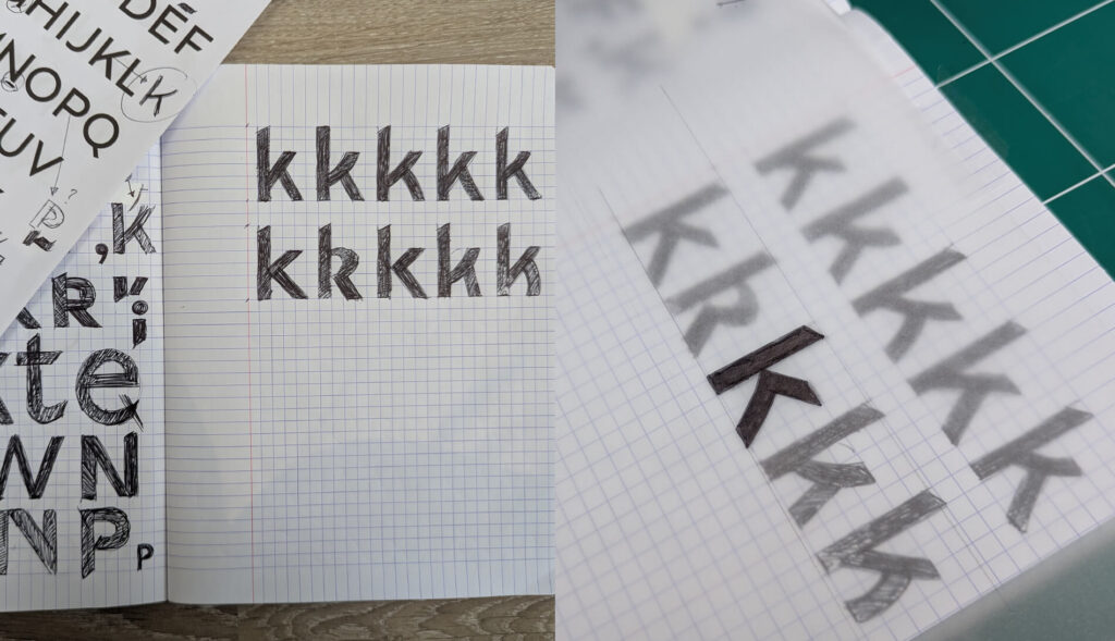
Instead of refining each letter immediately, I focus on multiplying attempts. I freely explore variations of the same shape without settling too early on a single design. For instance, rather than perfecting the first ‘a’, I prefer drawing several versions in succession. I test different proportions and curves before moving on to another idea.
For this exploratory phase, I primarily use a black ballpoint pen. This tool allows me to quickly establish a sharp contrast between the black of the letter and the white of the paper. Moreover, it provides an immediate sense of how the black interacts with the surrounding white space. This contrast makes it easier to analyze possible connections between letters and anticipate how they will harmonize within words.
The Power of repetition
Using a ballpoint pen offers another advantage: it doesn’t allow erasing, forcing me to redraw the same letter repeatedly, gradually improving it until it matches the intended idea. As Aristotle once said, « We are what we repeatedly do. Excellence, then, is not an act, but a habit. » This quote perfectly captures the importance of repetition in the process of typographic creation. By repeating a gesture, we anchor it within us. With this approach, the concept of the stroke improves over time, and our memory retains these shapes until we need to call upon them again during future prototyping.
Exploring variations in scale
One technique I consistently apply in my early sketches is testing my designs at different scales. This helps analyze their visual impact in both large and small formats. By doing so, I can assess how letterforms react to size variations and anticipate their readability in various contexts.
Let’s take the letter ‘e’, with a very open counter, as seen in certain versions of Garamond. Although it may seem elegant and perfectly readable in large sizes, it behaves differently when reduced. The subtleties of its design can fade, impairing its clarity and making the letter less recognizable, disrupting word reading.
Conversely, an ‘e’ with a smaller counterform behaves differently depending on scale. In small sizes, it appears denser and more compact. However, in larger sizes, its proportions and visual balance are perceived differently, which affects its overall look. This is a crucial step in typography design, as it helps anticipate not only readability but also consistency. Moreover, it ensures harmony across a wide range of applications, from body text to display use.
The Context of words and the connections of white space
After sketching the letters individually, I assemble them to observe how they connect within the context of words and how the white spaces interact between them. This step is crucial for evaluating the coherence of shapes and the fluidity of transitions, while paying close attention to the voids that shape readability and visual rhythm. The connections of white space play a decisive role: poorly managed spacing can create visual breaks or hinder reading, while a subtle balance between filled and empty spaces promotes typographic harmony. I adjust proportions and details to avoid any tension or imbalance that could disrupt the structure of the word.
The goal is to preserve the originality of each character while ensuring natural connections, where the white spaces actively contribute to the dynamics of the text. By refining these relationships, I aim to create a typographic design that breathes — cohesive and legible — where each letter finds its place in service of the whole.
Finalizing the Sketches
To finalize my sketches, I use tracing paper layered over my initial drawings. This allows me to isolate and preserve the best letterforms while refining the details. This method offers the flexibility needed to adjust proportions, correct imperfections, and gradually perfect the contours of the letters. By selecting the most relevant variations, I lay the foundation for the alphabet project I aim to conceptualize.
Ultimately, everyone will develop their own method that works best for them. Mine has allowed me to structure my sketches and refine my process, influencing both the final design and every step leading to it. Experimenting on paper is therefore not a waste of time; on the contrary, it is a key step that prevents rushing headlong into digital work and getting lost in endless adjustments. In the end, the best tools for creating your fonts are still your own hand and a simple pen.